|
| | A slider control allows a user to choose from a continuum of
values between a minimum and maximum value. Sliders were introduced in
Java 1.4, and behave somewhat like scrollbars, except that they can be visually
configured in a more pleasing way than scrollbars.
Here's an example of the use and configuration of a slider control:
package swingExamples;

import java.awt.BorderLayout;
import java.awt.Container;

import javax.swing.JFrame;
import javax.swing.JSlider;
import javax.swing.SwingConstants;

/**
 * A JFrame class to demonstrate JSlider usage.
 */
class SlidersFrame extends JFrame
{
  public SlidersFrame()
  {
    setTitle("Sliders");
    setDefaultCloseOperation(EXIT_ON_CLOSE);
    Container panel = getContentPane();
    panel.setLayout( new BorderLayout() );

    panel.add(
        new TitlePanel("Slider Configuration"),
                       BorderLayout.NORTH);

    JSlider slider = new JSlider();
    slider.setMajorTickSpacing(20);
    slider.setMinorTickSpacing(5);
    panel.add(
        new SliderPanel(slider), BorderLayout.CENTER);

    panel.add(
        new FeelPanel(SwingConstants.VERTICAL),
                      BorderLayout.WEST);

    ValuePanel valuePanel = new ValuePanel();
    panel.add(valuePanel, BorderLayout.EAST);
    valuePanel.setValue(slider);
    // Set up change listener so we can see the value
    slider.addChangeListener(valuePanel);

    ControlPanel controlPanel = new ControlPanel(slider);
    panel.add(controlPanel, BorderLayout.SOUTH);

    pack();
  }
}

public class Sliders
{
  public static void main(String[] args)
  {
    JFrame frame = new SlidersFrame();
    frame.setVisible(true);
  }
}
|
package swingExamples;

import java.awt.Color;
import javax.swing.JLabel;
import javax.swing.JPanel;
import javax.swing.SwingConstants;

/**
 * A panel to display a title string
 */
public class TitlePanel extends JPanel
{
  public TitlePanel(String title)
  {
    JLabel label =
        new JLabel(title,
                   SwingConstants.CENTER);
    label.setForeground(Color.BLUE);
    add(label);
  }
}
|
package swingExamples;

import java.awt.BorderLayout;
import java.awt.Color;

import javax.swing.BorderFactory;
import javax.swing.JPanel;
import javax.swing.JSlider;

/**
 * A panel to display a JSlider component
 */
public class SliderPanel extends JPanel
{
  public SliderPanel(JSlider slider)
  {
    m_slider = slider;
    setBackground(Color.WHITE);
    setBorder(
        BorderFactory.createTitledBorder("Slider:") );
    add(m_slider);
    m_slider.setBorder(
        BorderFactory.createLineBorder(Color.BLUE));
  }

  ////// Private data /////
  private JSlider m_slider;
}
|
package swingExamples;

import javax.swing.BorderFactory;
import javax.swing.JLabel;
import javax.swing.JPanel;
import javax.swing.JSlider;
import javax.swing.SwingConstants;
import javax.swing.event.ChangeEvent;
import javax.swing.event.ChangeListener;

public class ValuePanel extends JPanel
    implements ChangeListener
{
  public ValuePanel()
  {
    setBorder(
        BorderFactory.createCompoundBorder(
        BorderFactory.createEmptyBorder(0, 5, 0, 5),
        BorderFactory.createTitledBorder("Value:")
        ) );
    JPanel valueContentsPanel = new JPanel();
    add(valueContentsPanel);
    valueContentsPanel.add(m_valueLabel);
  }

  public void setValue(JSlider slider)
  {
    m_valueLabel.setText("" + slider.getValue());
  }

  public void stateChanged(ChangeEvent event)
  {
    JSlider slider = (JSlider)event.getSource();
    setValue(slider);
  }

  //// Private data ////

  // A label that shows the current value of the slider
  private JLabel m_valueLabel =
      new JLabel("", SwingConstants.CENTER);
}
|
package swingExamples;

import java.awt.BorderLayout;
import java.awt.Color;
import java.awt.FlowLayout;
import java.awt.event.ActionEvent;
import java.awt.event.ActionListener;
import java.util.Dictionary;
import java.util.Hashtable;

import javax.swing.BorderFactory;
import javax.swing.ButtonGroup;
import javax.swing.ImageIcon;
import javax.swing.JCheckBox;
import javax.swing.JFrame;
import javax.swing.JLabel;

import javax.swing.JPanel;
import javax.swing.JRadioButton;
import javax.swing.JSlider;
import javax.swing.SwingUtilities;

/**
 * A control panel used to configure the layout
 * and properties of a slider component.
 */
public class ControlPanel extends JPanel
    implements ActionListener
{
  public ControlPanel(JSlider slider)
  {
    m_slider = slider;  // The slider being configured
    loadImages();       // Load the icon images

    setLayout( new BorderLayout() );
    setBorder(
        BorderFactory.createTitledBorder("Configure:") );

    // Create a panel to contain the first set of checkboxes
    JPanel checkboxPanel = new JPanel();
    add(checkboxPanel, BorderLayout.NORTH);
    // Add the checkbox controls to the checkbox panel
    checkboxPanel.add(m_ticks);
    checkboxPanel.add(m_snap);
    checkboxPanel.add(m_track);
    checkboxPanel.add(m_inverted);
    // Create a panel to contain the orientation buttons
    JPanel orientationPanel = new JPanel(
        new FlowLayout(FlowLayout.LEFT) );
    add(orientationPanel, BorderLayout.CENTER);
    JPanel orientationButtonsPanel = new JPanel();
    orientationPanel.add(orientationButtonsPanel);
    orientationButtonsPanel.setBorder(
        BorderFactory.createTitledBorder("Orientation:") );
    // Add the orientation radio buttons to the inner
    // panel, adding action listeners as we go.
    ActionListener orientationListener =
        new OrientationHandler();
    for (JRadioButton button : m_orientationButtons)
    {
      orientationButtonsPanel.add(button);
      button.addActionListener(orientationListener);
    }

    // Create a panel to contain the label-related stuff
    JPanel labelPanel = new JPanel();
    add(labelPanel, BorderLayout.SOUTH);
    // Add the Show labels checkbox to the label panel
    labelPanel.add(m_labels);

    // Create a panel to hold the label radio buttons
    // and add it to the control panel.
    JPanel labelButtonPanel = new JPanel();
    labelButtonPanel.setBorder(
        BorderFactory.createTitledBorder("Label Type:")
        );
    labelPanel.add(labelButtonPanel, BorderLayout.SOUTH);
    // Add the radio buttons to the panel, adding
    // action listeners as we go.
    ActionListener labelButtonListener =
        new LabelTypeActionHandler();
    for (JRadioButton button : m_labelButtons)
    {
      labelButtonPanel.add(button);
      button.addActionListener(labelButtonListener);
    }
  }

  // Required by ActionListener
  // This handles only the checkbox actions.
  public void actionPerformed(ActionEvent event)
  {
    JCheckBox box = (JCheckBox) event.getSource();
    if (box == m_ticks)
    {
      m_slider.setPaintTicks(
          m_ticks.isSelected() );
    }
    else if (box == m_snap)
    {
      m_slider.setSnapToTicks(
          m_snap.isSelected() );
    }
    else if (box == m_track)
    {
      m_slider.setPaintTrack(
          m_track.isSelected() );
    }
    else if (box == m_inverted)
    {
      m_slider.setInverted(
          m_inverted.isSelected() );
    }
    else if (box == m_labels)
    {
      m_slider.setPaintLabels(
          m_labels.isSelected() );
    }

    repaintFrame();
  }

  private void repaintFrame()
  {
    // Cause the frame to be repainted and resized
    SwingUtilities.getWindowAncestor(this).pack();
  }

  ///// Private data /////

  private JSlider m_slider;  // The slider being configured.

  // Checkbox controls
  private JCheckBox m_ticks = new JCheckBox("Show Ticks");
  private JCheckBox m_snap = new JCheckBox("Snap to ticks");
  private JCheckBox m_track = new JCheckBox("Show Track", true);
  private JCheckBox m_inverted = new JCheckBox("Inverted");

  // Orientation radio buttons
  private ButtonGroup m_orientationGroup = new ButtonGroup();
  private static final String
      HORIZONTAL = "Horizontal",
      VERTICAL   = "Vertical";
  private static final String[] ORIENTATION_ACTIONS =
  {
    HORIZONTAL, VERTICAL
  };
  private JRadioButton[] m_orientationButtons =
  {
    new JRadioButton(HORIZONTAL, true),
    new JRadioButton(VERTICAL)
  };
  // Add radio buttons to button group
  {
    int index = 0;
    for (JRadioButton button : m_orientationButtons)
    {
      m_orientationGroup.add(button);
      String command = ORIENTATION_ACTIONS[index++];
      button.setActionCommand(command);
    }
  }

  // Labels checkbox
  private JCheckBox m_labels = new JCheckBox("Show Labels");

  // Add listeners to checkbox controls
  {
    m_ticks.addActionListener(this);
    m_snap.addActionListener(this);
    m_track.addActionListener(this);
    m_inverted.addActionListener(this);
    m_labels.addActionListener(this);
  }

  // Radio button controls
  private ButtonGroup m_labelsGroup = new ButtonGroup();
  private static final String
      DEFAULT = "Default",
      CUSTOM  = "Custom",
      ICONS   = "Icons";
  private static final String[] LABEL_COMMANDS =
  {
    DEFAULT, CUSTOM, ICONS
  };
  private JRadioButton[] m_labelButtons =
  {
    new JRadioButton("Default", true),
    new JRadioButton("Custom (A,B,C...)"),
    new JRadioButton("Icons")
  };
  // Add radio buttons to button group
  {
    int index = 0;
    for (JRadioButton button : m_labelButtons)
    {
      m_labelsGroup.add(button);
      String command = LABEL_COMMANDS[index++];
      button.setActionCommand(command);
    }
  }

  ///// Labels for customizing the slider /////

  // A dictionary to hold custom JLabels for the apha labels
  private Dictionary<Integer, JLabel> m_labelTable =
      new Hashtable<Integer, JLabel>();
  // Initialize the label table
  {
    m_labelTable.put(0, new JLabel("A"));
    m_labelTable.put(20, new JLabel("B"));
    m_labelTable.put(40, new JLabel("C"));
    m_labelTable.put(60, new JLabel("D"));
    m_labelTable.put(80, new JLabel("E"));
    m_labelTable.put(100, new JLabel("F"));
  };

  // A dictionary to hold JLabels for the icon labels
  private Dictionary<Integer, JLabel> m_iconLabelTable =
      new Hashtable<Integer, JLabel>();

  /**
   * Loads the images for the above icon labels
   */
  private void loadImages()
  {
    // Image file names are relative to the current class
    final String[] iconPaths =
    {
      "images/nine.gif", "images/ten.gif",
      "images/jack.gif", "images/queen.gif",
      "images/king.gif", "images/ace.gif"
    };

    // Initialize the icon label table
    Class base = this.getClass();
    int i = 0;
    for (String path : iconPaths)
    {
      ImageIcon icon =
          ImageUtilities.createImageIcon(base, path);
      m_iconLabelTable.put(i, new JLabel(icon));
      i += 20;
    }
  }

  //////// Inner classes ////////

  /**
   * This class handles the label type radio button actions
   */
  class LabelTypeActionHandler
      implements ActionListener
  {
    public void actionPerformed(ActionEvent event)
    {
      String command =
          m_labelsGroup.getSelection().getActionCommand();
      if (command.equals(DEFAULT))
      {
        m_slider.setLabelTable(null);
        m_slider.setPaintLabels(m_labels.isSelected());
      }
      else if (command.equals(CUSTOM))
      {
        m_slider.setLabelTable(m_labelTable);
      }
      else if (command.equals(ICONS))
      {
        m_slider.setLabelTable(m_iconLabelTable);
      }

      // Repaint/resize frame
      repaintFrame();
    }
  }

  /**
   * This class handles the orientation radio
   * button actions.
   */
  class OrientationHandler
      implements ActionListener
  {
    public void actionPerformed(ActionEvent event)
    {
      String action = event.getActionCommand();
      if (action.equals(HORIZONTAL))
      {
        m_slider.setOrientation(JSlider.HORIZONTAL);
      }
      else if (action.equals(VERTICAL))
      {
        m_slider.setOrientation(JSlider.VERTICAL);
      }
      repaintFrame();
    }
  }

  /**
   * Main entry point, for testing
   */
  public static void main(String[] args)
  {
    JFrame frame = new JFrame();
    JPanel panel = (JPanel)frame.getContentPane();
    panel.setLayout( new BorderLayout() );

    JPanel sliderPanel = new JPanel();
    JSlider slider = new JSlider();
    slider.setBorder(
        BorderFactory.createLineBorder(Color.BLUE));
    slider.setMajorTickSpacing(20);
    slider.setMinorTickSpacing(5);
    sliderPanel.add(slider);

    panel.add(sliderPanel, BorderLayout.CENTER);
    panel.add( new ControlPanel(slider), BorderLayout.SOUTH );
    frame.pack();
    frame.setVisible(true);
  }
}
|
package swingExamples;

import java.awt.BorderLayout;
import java.awt.GridLayout;
import java.awt.Window;
import java.awt.event.ActionEvent;
import java.awt.event.ActionListener;

import javax.swing.BorderFactory;
import javax.swing.ButtonGroup;
import javax.swing.JFrame;
import javax.swing.JPanel;
import javax.swing.JRadioButton;
import javax.swing.SwingConstants;
import javax.swing.SwingUtilities;

/**
 * A panel that can be used to allow the
 * user to control the current look and feel
 * of an application
 */
public class FeelPanel extends JPanel
    implements ActionListener
{
  /**
   * Creates a look and feel panel with the
   * radio boxes laid out in a horizontal
   * orientation
   */
  public FeelPanel()
  {
    this(SwingConstants.HORIZONTAL);
  }

  /**
   * Creates a Look and Feel panel with the
   * radio boxes laid out in a horizontal or
   * vertical orientation, depending on the
   * user's choice.
   * @param orientation the horizontal or vertical
   *                    orientation (allowed values:
   *                    SwingConstants.HORIZONTAL or
   *                    SwingConstants.VERTICAL)
   */
  public FeelPanel(int orientation)
  {
    GridLayout layout = null;
    if (orientation == SwingConstants.HORIZONTAL)
      layout = new GridLayout(1, m_feelButtons.length);
    else
      layout = new GridLayout(m_feelButtons.length, 1);
    JPanel feelButtonsPanel = new JPanel(layout);
    add(feelButtonsPanel);
    feelButtonsPanel.setBorder(
        BorderFactory.createTitledBorder("Look & Feel:") );
    // Add the radio buttons to the panel, adding
    // action listeners as we go.
    for (JRadioButton button : m_feelButtons)
    {
      feelButtonsPanel.add(button);
      button.addActionListener(this);
    }
  }

  // Required for ActionListener
  public void actionPerformed(ActionEvent event)
  {
    // Responds to the specified action by dynamically
    // changing the look and feel of the application.
    String action = event.getActionCommand();
    Window ancestor = SwingUtilities.getWindowAncestor(this);
    LookAndFeel.setLookAndFeel(action, ancestor);
    ancestor.pack();
  }

  ///// Private data /////

  // Radio buttons for showing look and feel rendering of slider
  private ButtonGroup m_feelGroup = new ButtonGroup();
  private String[] m_feelCommands =
  {
    LookAndFeel.METAL, LookAndFeel.SYSTEM, LookAndFeel.MOTIF
  };
  private JRadioButton[] m_feelButtons =
  {
    new JRadioButton(LookAndFeel.METAL, true),
    new JRadioButton(LookAndFeel.SYSTEM),
    new JRadioButton(LookAndFeel.MOTIF)
  };
  // Add radio buttons to button group
  {
    int index = 0;
    for (JRadioButton button : m_feelButtons)
    {
      if (index == 0)
        button.setSelected(true);
      m_feelGroup.add(button);
      String command = m_feelCommands[index++];
      button.setActionCommand(command);
    }
  }

  /**
   * Main entry point, for testing
   */
  public static void main(String[] args)
  {
    JFrame frame = new JFrame();
    JPanel panel = (JPanel) frame.getContentPane();
    panel.add(
        new FeelPanel(SwingConstants.VERTICAL),
        BorderLayout.WEST);
    panel.add(
        new FeelPanel(SwingConstants.HORIZONTAL),
        BorderLayout.NORTH);
    frame.pack();
    frame.setVisible(true);
  }
}
|
package swingExamples;

import java.awt.Component;
import javax.swing.SwingUtilities;
import javax.swing.UIManager;
import javax.swing.UnsupportedLookAndFeelException;

/**
 * A class to provide support for changing look and feel.
 *
 * @author Bryan Higgs
 * @version 1.0
 */
public abstract class LookAndFeel
{
  public static final String METAL   = "Metal",
                             SYSTEM  = "System",
                             MOTIF   = "Motif";

  /**
   * Changes look and feel and changes it dynamically for
   * the component tree starting at component.
   */
  public static void setLookAndFeel(String feel,
                                    Component component)
  {
    if (feel != null)
    {
      if (feel.equals(METAL))
      {
        feel = UIManager.getCrossPlatformLookAndFeelClassName();
      }
      else if (feel.equals(SYSTEM))
      {
        feel = UIManager.getSystemLookAndFeelClassName();
      }
      else if (feel.equals(MOTIF))
      {
        feel = "com.sun.java.swing.plaf.motif.MotifLookAndFeel";
      }
      else
      {
        System.err.println(
            "Unexpected value of look and feel specified: "
            + feel);
        feel = UIManager.getCrossPlatformLookAndFeelClassName();
      }

      try
      {
        UIManager.setLookAndFeel(feel);
        SwingUtilities.updateComponentTreeUI(component);
      }
      catch (ClassNotFoundException e)
      {
        System.err.println(
            "Couldn't find class for specified look and feel:"
            + feel);
        System.err.println(
            "Did you include the L&F library in the class path?");
        System.err.println("Using the default look and feel.");
      }
      catch (UnsupportedLookAndFeelException e)
      {
        System.err.println(
            "Can't use the specified look and feel ("
            + feel + ") on this platform.");
        System.err.println("Using the default look and feel.");
      }
      catch (Exception e)
      {
        System.err.println(
            "Couldn't get specified look and feel ("
            + feel + "), for some reason.");
        System.err.println("Using the default look and feel.");
        e.printStackTrace();
      }
    }
  }
}
|
package swingExamples;

import java.awt.Toolkit;
import java.io.BufferedInputStream;
import java.io.IOException;
import javax.swing.ImageIcon;

/**
 * A class to provide utility methods for dealing
 * with images and icons.
 *
 * @author Bryan Higgs
 * @version 1.0
 */
public abstract class ImageUtilities
{
  /**
   * Returns an ImageIcon, or null if the path was invalid
   * When running  using Java Plug-in, getResourceAsStream
   * is more efficient than getResource
   */
  protected static ImageIcon createImageIcon(
                                Class baseClass, String path)
  {
    int MAX_IMAGE_SIZE = 124000;
            // Change this to the size of
            // the largest image, in bytes
    int count = 0;
    BufferedInputStream imgStream = new BufferedInputStream(
        baseClass.getResourceAsStream(path));
    if (imgStream != null)
    {
      byte buf[] = new byte[MAX_IMAGE_SIZE];
      try
      {
        count = imgStream.read(buf);
      }
      catch (IOException ieo)
      {
        System.err.println(
            "Couldn't read stream from file: " + path);
      }

      try
      {
        imgStream.close();
      }
      catch (IOException ieo)
      {
        System.err.println("Can't close file " + path);
      }

      if (count <= 0)
      {
        System.err.println("Empty file: " + path);
        return null;
      }
      return new ImageIcon(
          Toolkit.getDefaultToolkit().createImage(buf));
    }
    else
    {
      System.err.println("Couldn't find file: " + path);
      return null;
    }
  }
}
|
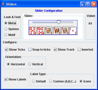
which produces something that, on my Microsoft XP system, looks like this:
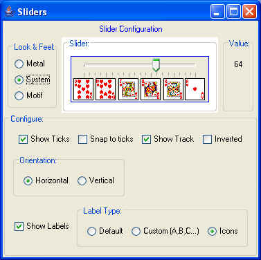
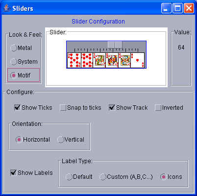
and if you click on the Look and Feel radio buttons, you'll see changes
like:
or:
As you set or unset the appropriate checkboxes and radio buttons, the slider
changes its visual appearance.
If you want to try this out in real time, try clicking on the following launch
button:
 (You must have Java Web Start 1.5 or later installed on your system -- that
should be the default for most Java installations.)
(You must have Java Web Start 1.5 or later installed on your system -- that
should be the default for most Java installations.)
Note: Be patient when changing Look and
Feel in this application. On occasion, I have found
the System look and feel to be rather sluggish the first time it's selected.
|